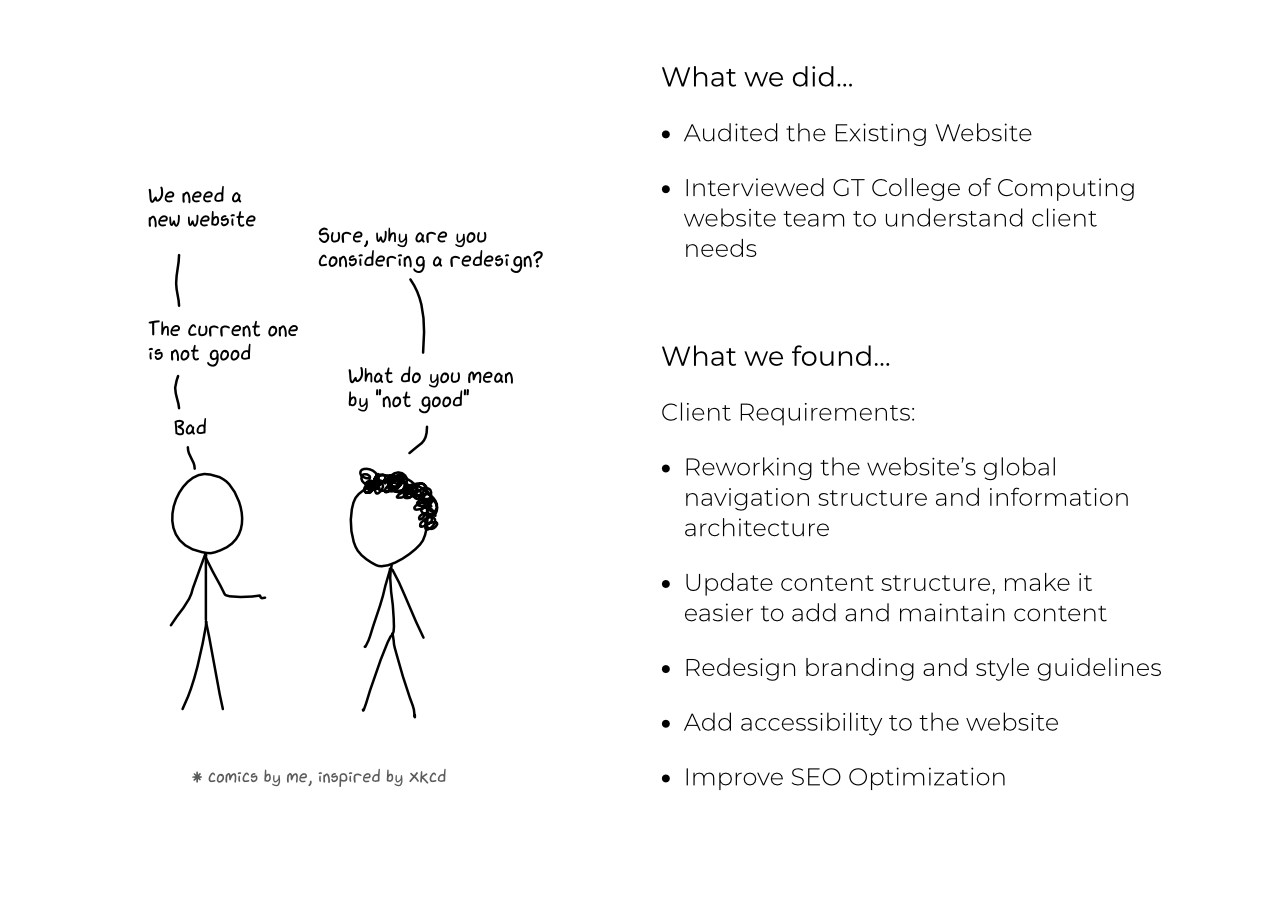
From the initial meetings with the CoC Website Team, we got a fair overview of what was expected in the redesign. From here, we looked at all the insights we would need at this stage and then chalked up a plan detailing the first stage of research activities that would give us these insights.
We worked on conducting a competitive analysis, deep dive of Google analytics and stakeholder interview in parallel. This was done to conduct a preliminary research on the existing website and help us hone in on further research activities.
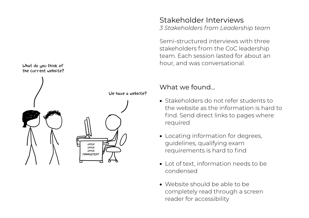
From our meeting with the website team it was clear that we needed a further understanding of the thought process, intent and driving force behind the website which was the College of Computing leadership. We set up meetings with the dean, the director and an accessibility expert associated with the college.
The stakeholders we interviewed had varying responsibilities within and outside the College of Computing, so our interviews allowed us to hear from other parts of the administration and university. Our main goals were to highlight the issues that the stakeholders struggle with on a daily basis, identify problematic or missing site content that stakeholder would like to see addressed, assign a priority to the issues identified by the CoC website team (from earlier meeting) and finally gain a basic understanding of accessibility tools and how they can be used in website design.
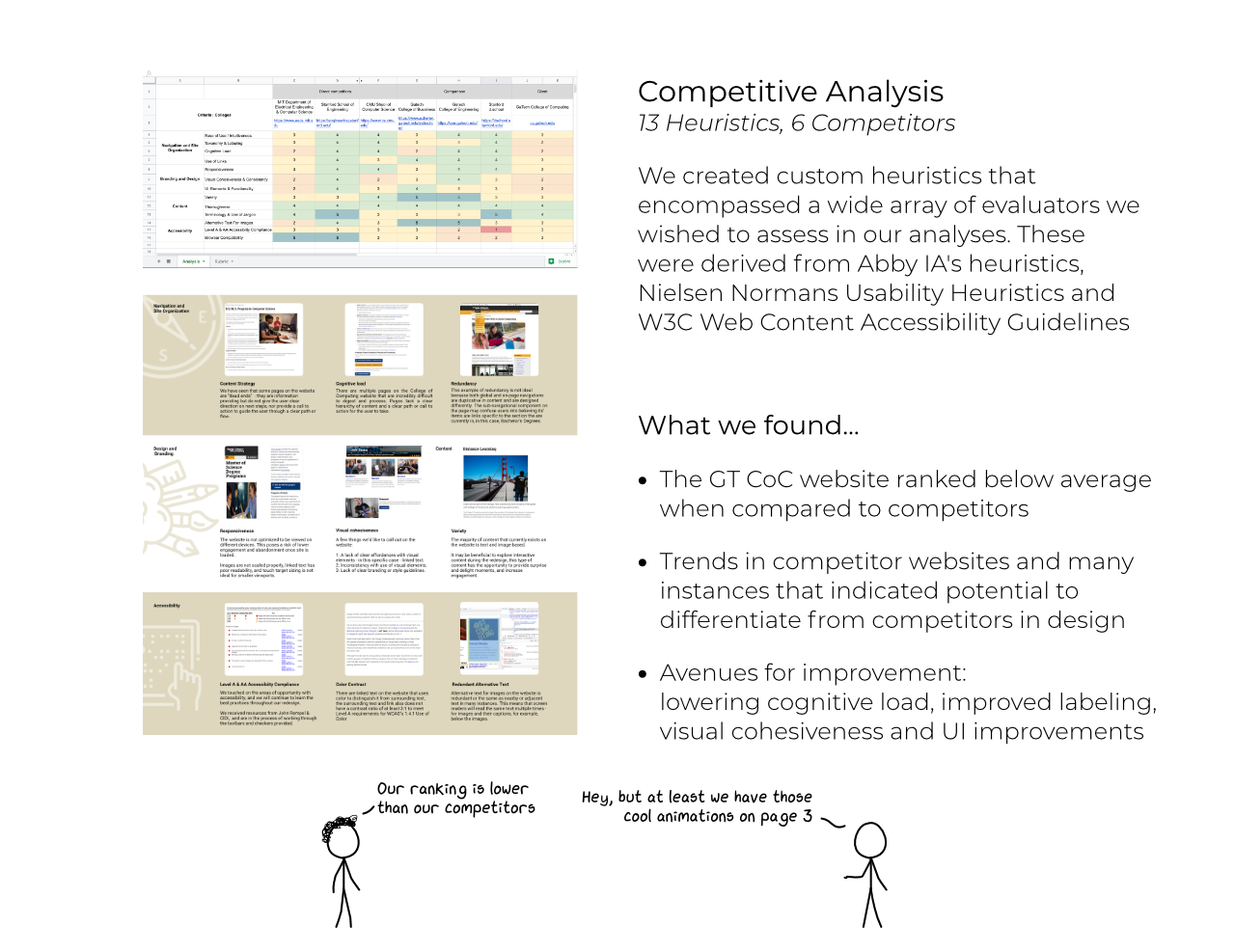
We extrapolated evaluative criteria from a larger set of widely used common principles and best practices, or heuristics, and applied them to a competitive analysis as well as a heuristic evaluation in order to diagnose the College of Computing website’s current state. We reached for multiple sets of heuristics in order to expand our analyses to include multiple perspectives, as well as create a custom set of heuristics to best fit College of Computing’s redesign objectives.
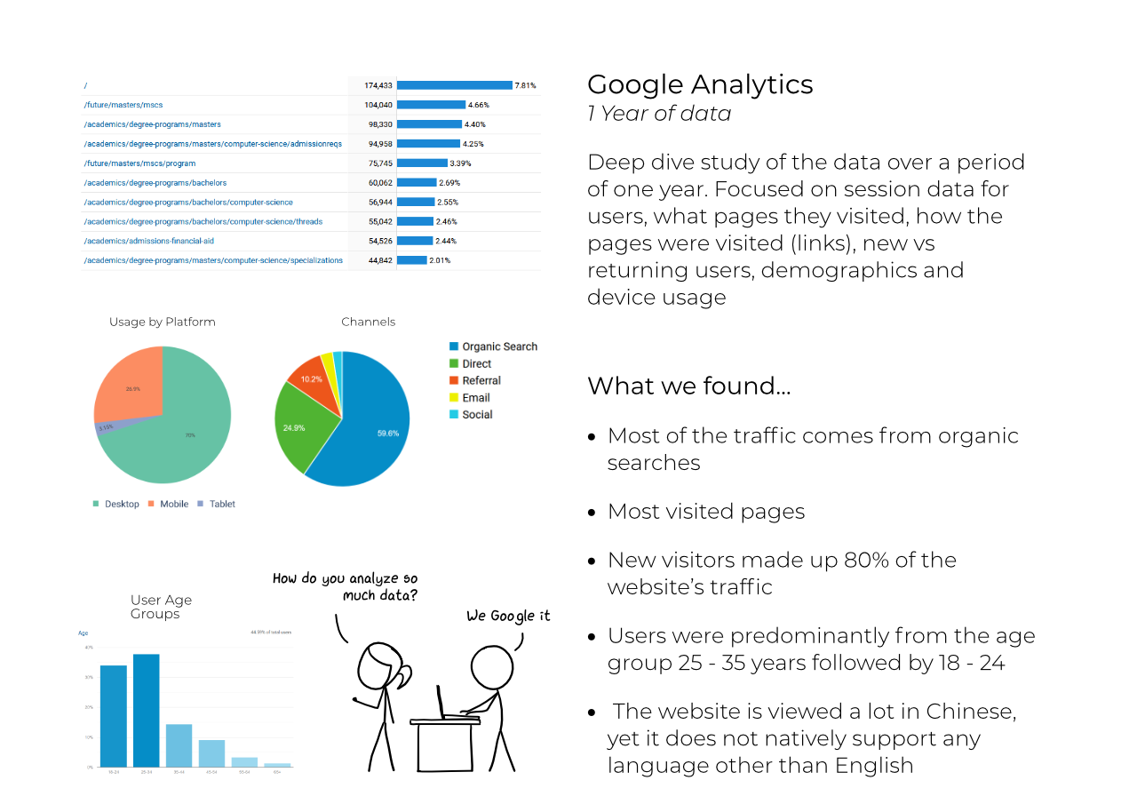
The College of Computing website has upwards of 50,000 users every month. With Google Analytics integrated into the website, it is possible to access information on how these users click through the website. We wanted to gain a deeper understanding of session data - including bounce rates, click rates, and session times - so we may gauge how users were navigating through the website, where they were coming from, and how long they were staying. In order to do this, we focused primarily on session data and top page views, and added a secondary dimension of new users and returning users, demographics, user platform (mobile vs desktop) when viewing the data on the analytics reporting tool. This information was useful in identifying areas of friction we wanted to target, as well as directing us on which user studies to investigate for further analysis.
Our initial interviews with the client and stakeholder along with the insights we got from our initial research helped us shape the path for the next stage of research activities. Our research plan was designed in a manner such that the completed research activities determined which areas to focus on and led into the next research activity.
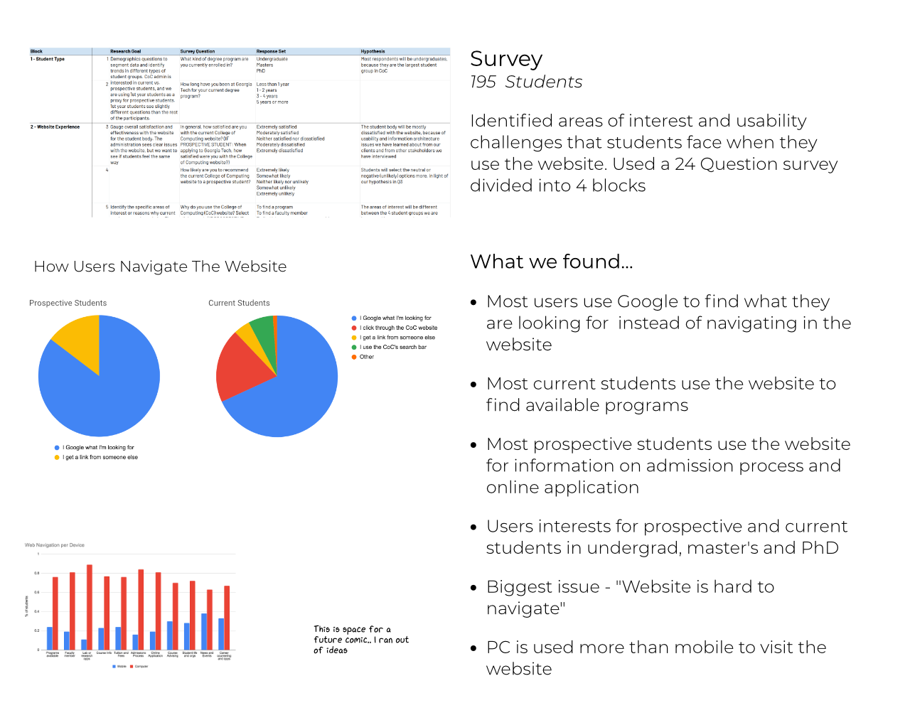
For our survey, we wanted to identify the areas of interest and usability challenges that students in College of Computing face when they use the website. We chose a survey because we wanted to size many of the issues we identified in our conversations with our stakeholders as well as initial research. We also wanted to reach a larger sample and identify trends related to these challenges, across various user groups. The survey allowed us to collect a large amount of data and parse it based on user groups.
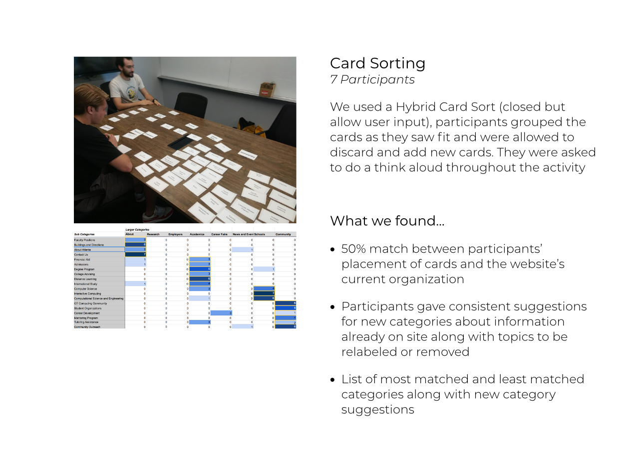
With our hybrid card sorting task, we wanted to identify patterns in how visitors expect to see the website content to be organized. The data from our survey indicated that navigation was a major difficulty that users faces. Through a card sort task, we gathered data on what the most natural navigation hierarchy for the website could be. The card sorting task worked as a precursor for our next step: redoing the website’s information architecture. We used the grouping patterns from this task to inform how we might reorganize, trim, or add to the content.
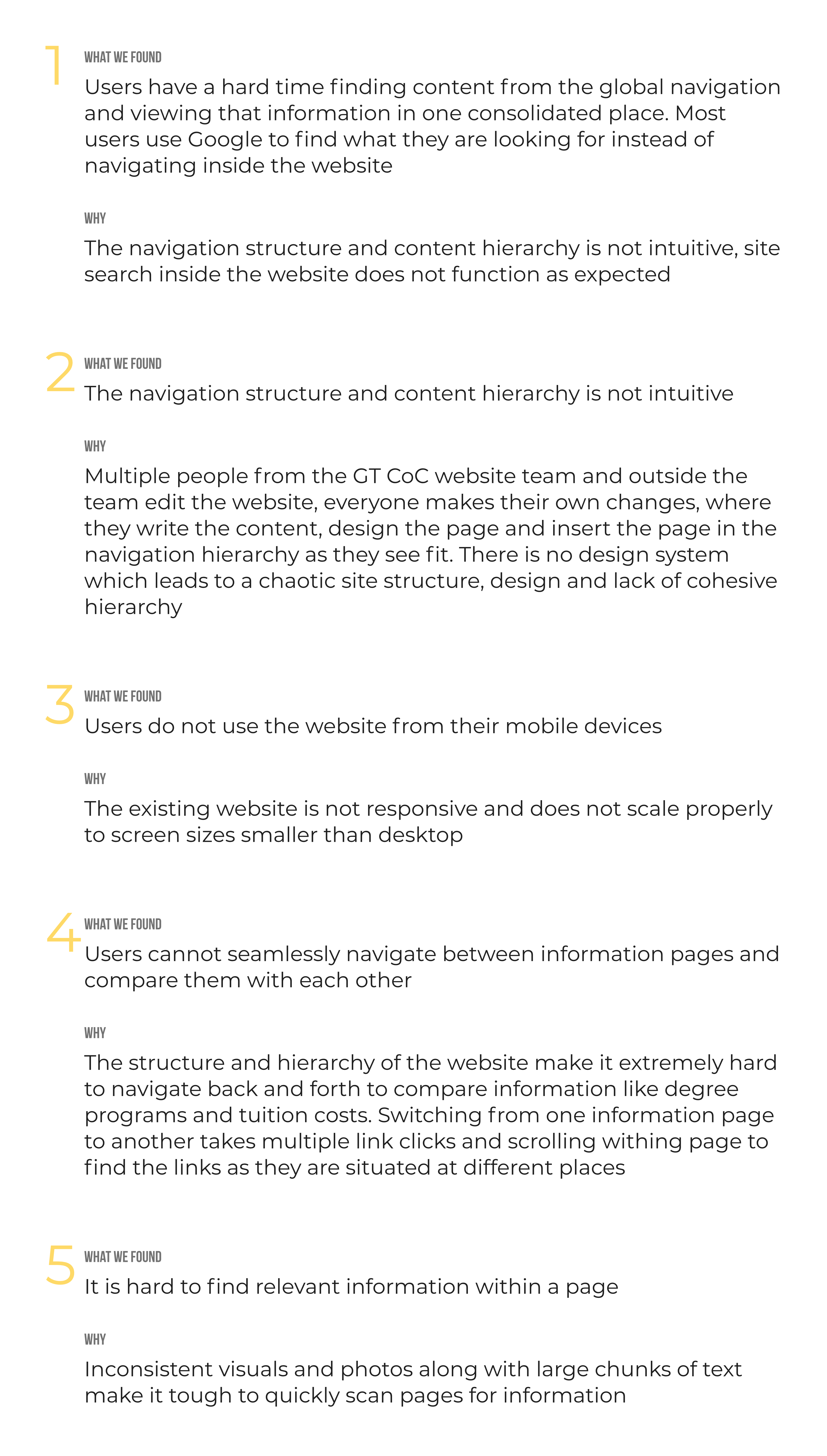
From all the research activities, we collected a trove of user data that needed to be converted into meaningful research insights. To aid in this process, we created an affinity map which helped us generate themes and synthesize results into actionable findings. We gleaned insights on a multitude of categories, namely, what people look for, what are the most/least popular navigation items on the site, and what difficulties people are having while using the website.
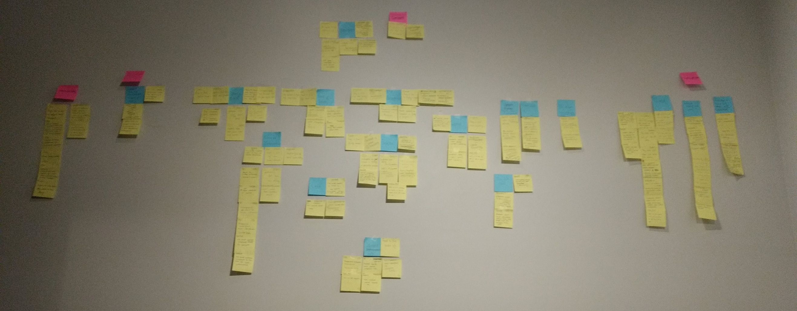
We found that the issues users faced with the existing website could be categorized into four major themes: Navigation, Website Organization, Content, Responsiveness.
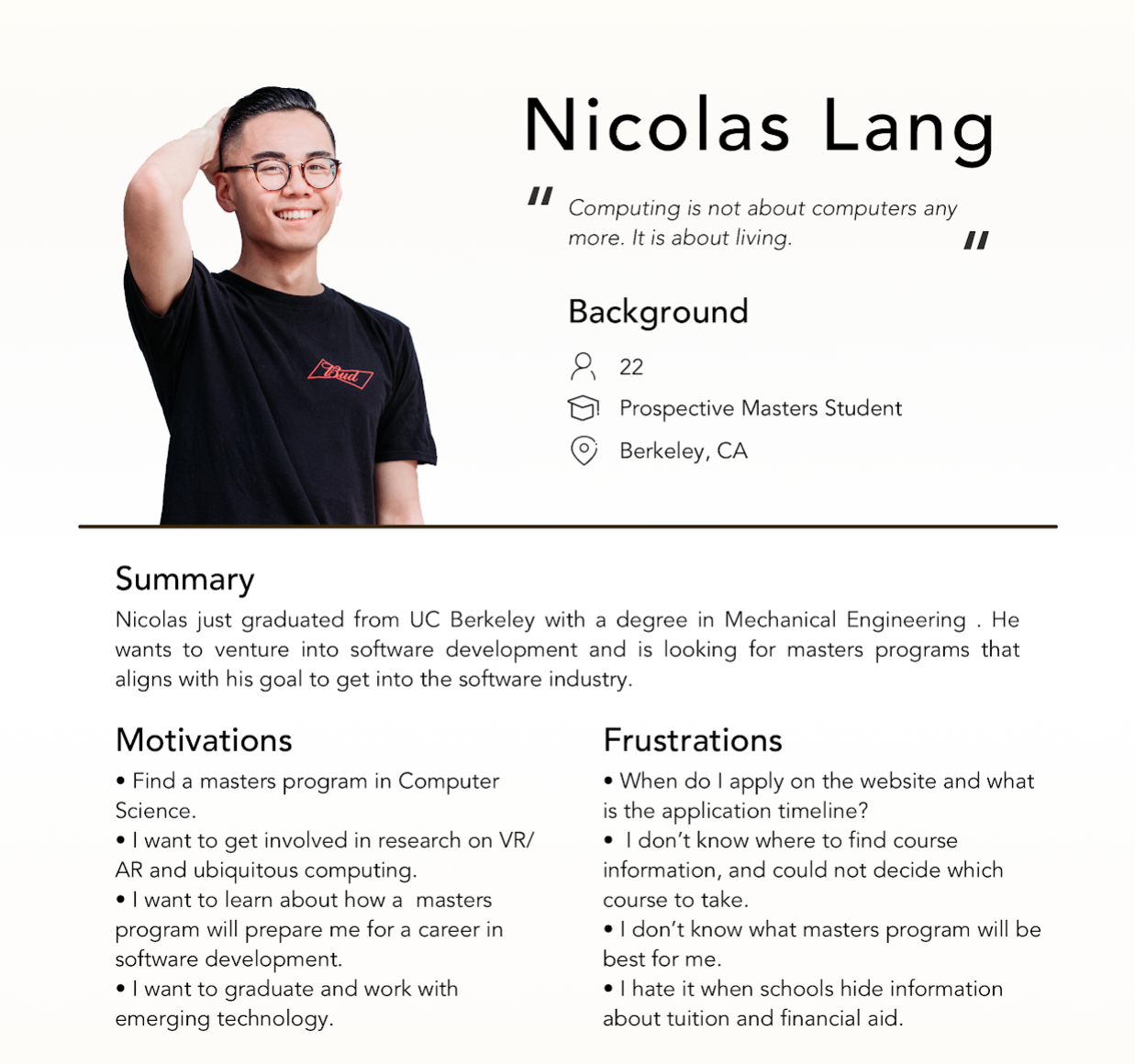
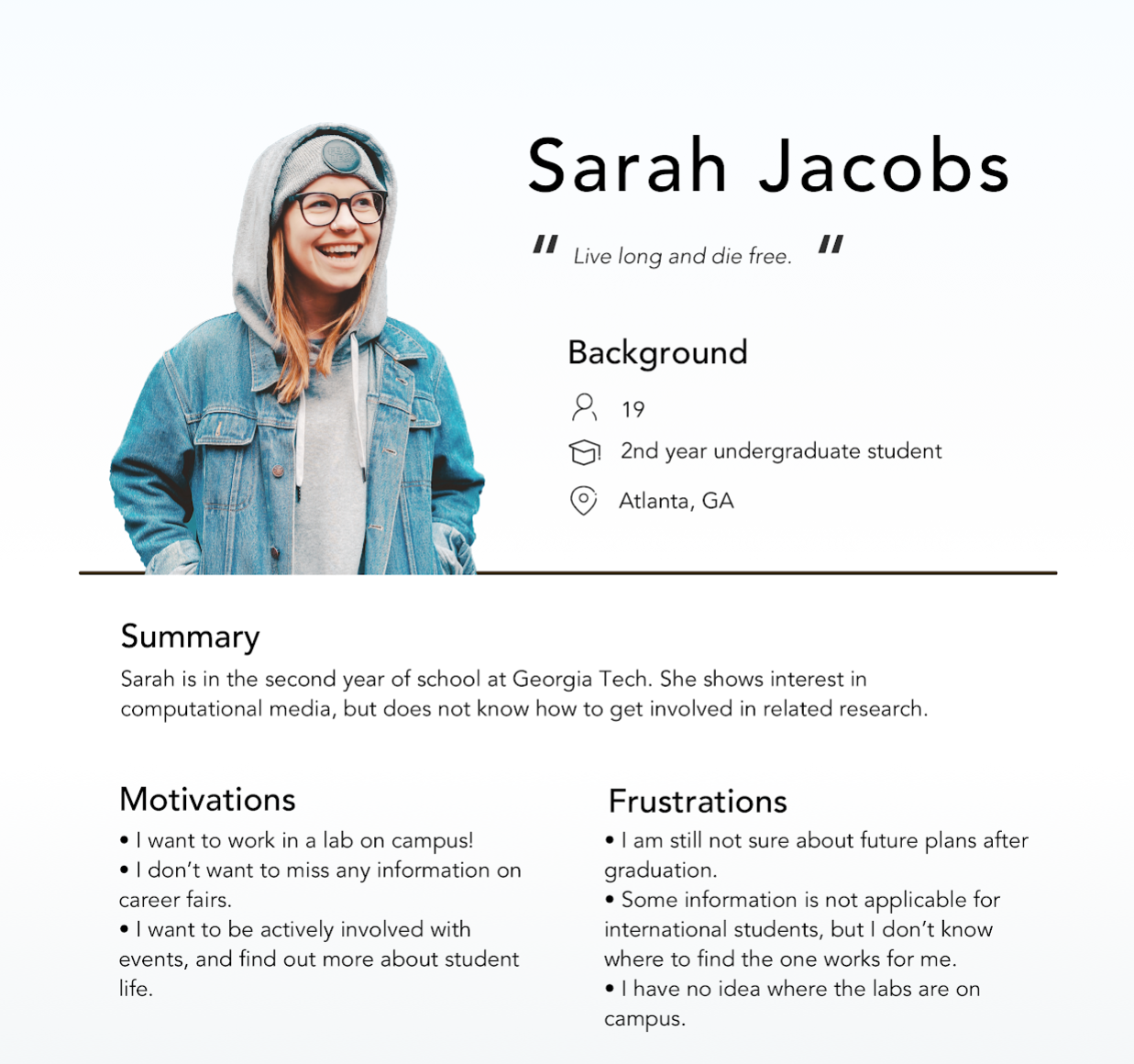
From the insights we found, we created user personas that would guide the next stage of the design process.
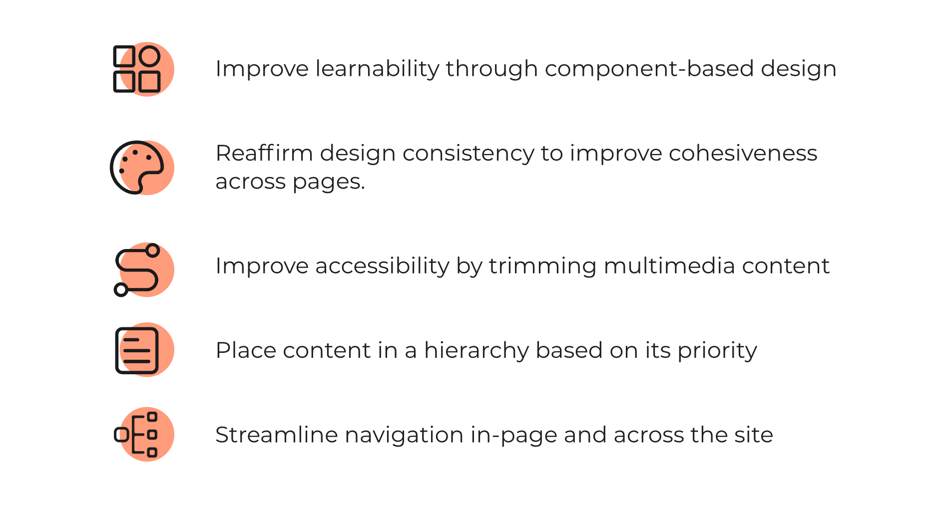
We began designing with a goal of these actionable findings
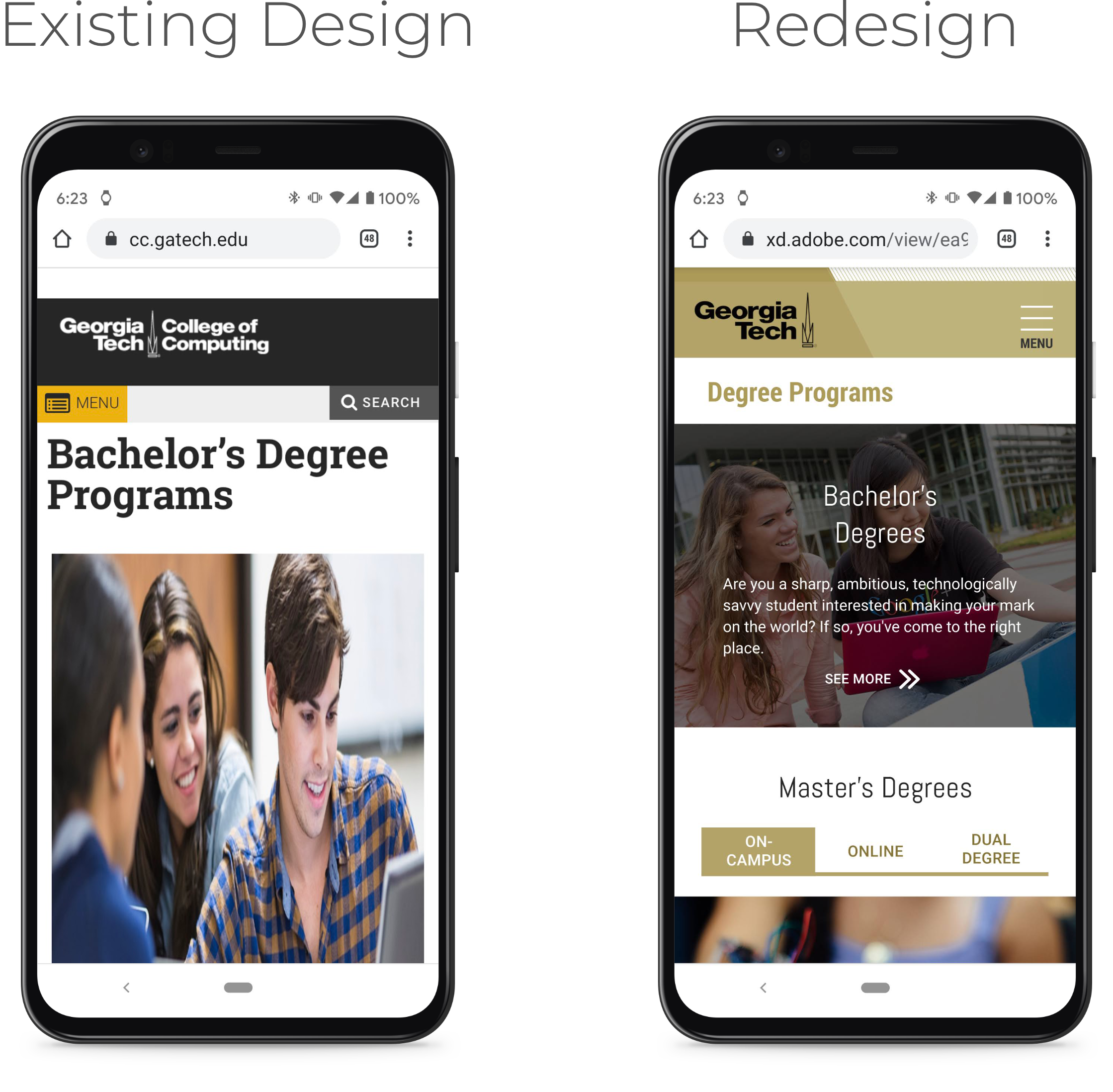
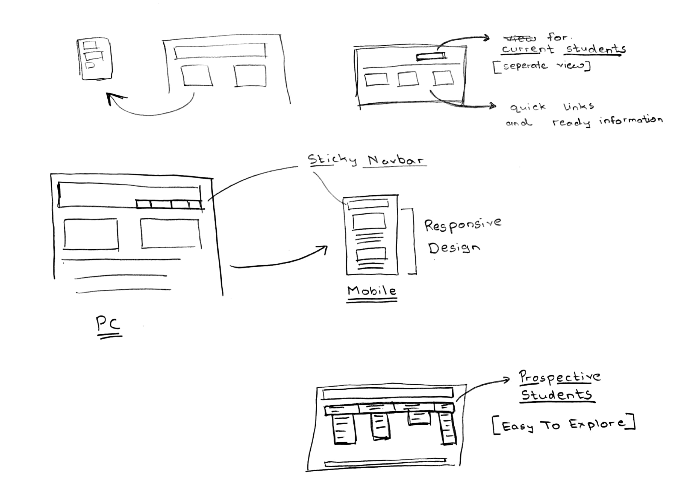
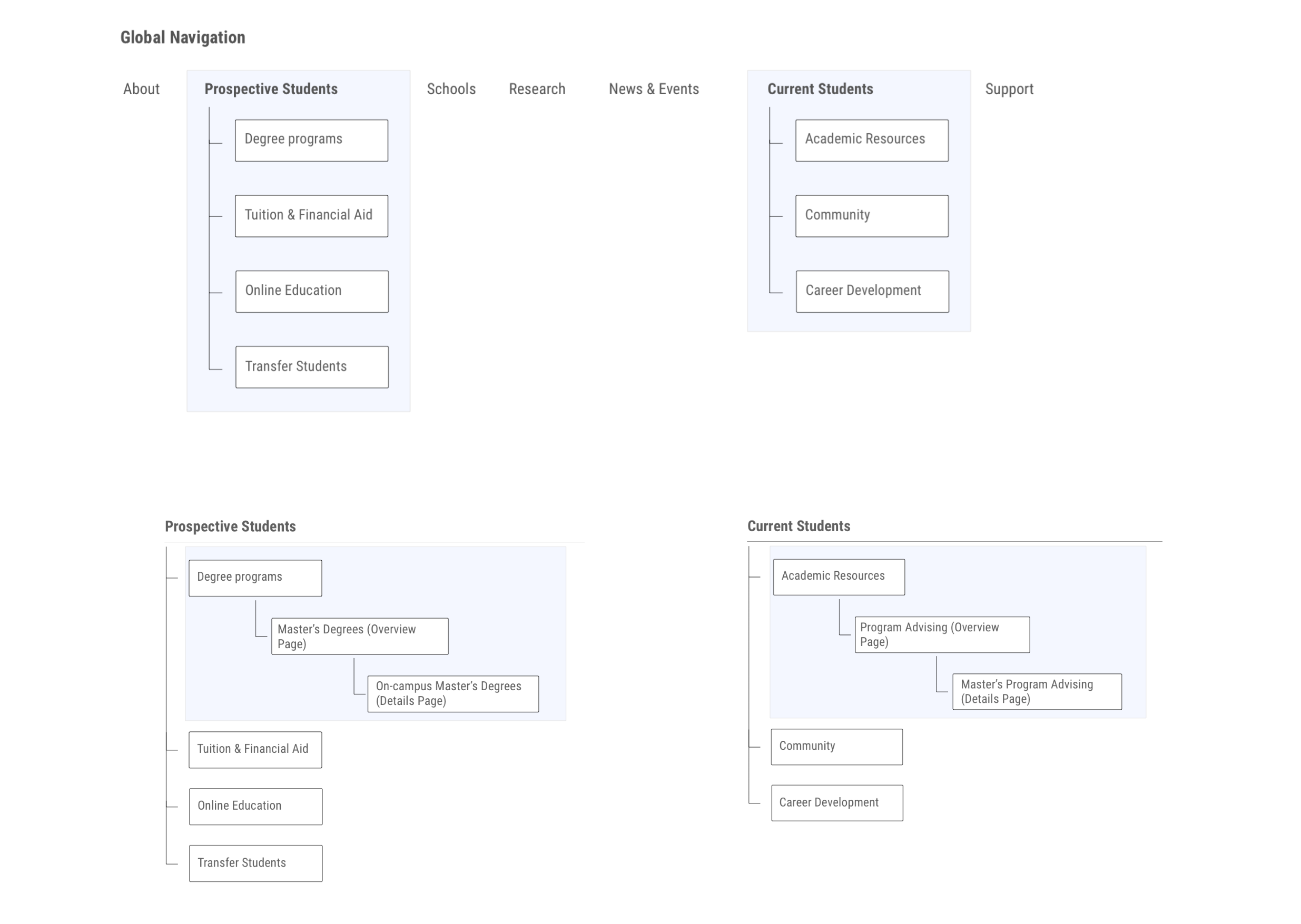
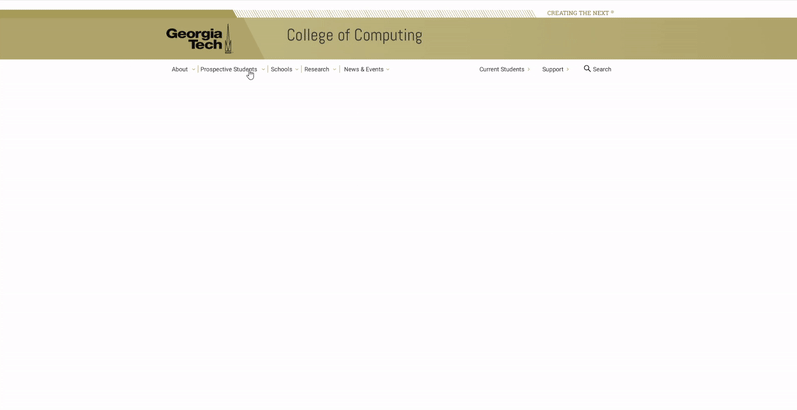
Using the insights from our research and ideation, we created a high level diagram of the website global navigation. This design was informed by our findings from the card sorting task, survey results and Google Analytics findings. We created new navigation paths catering to the needs of prospective and current students.
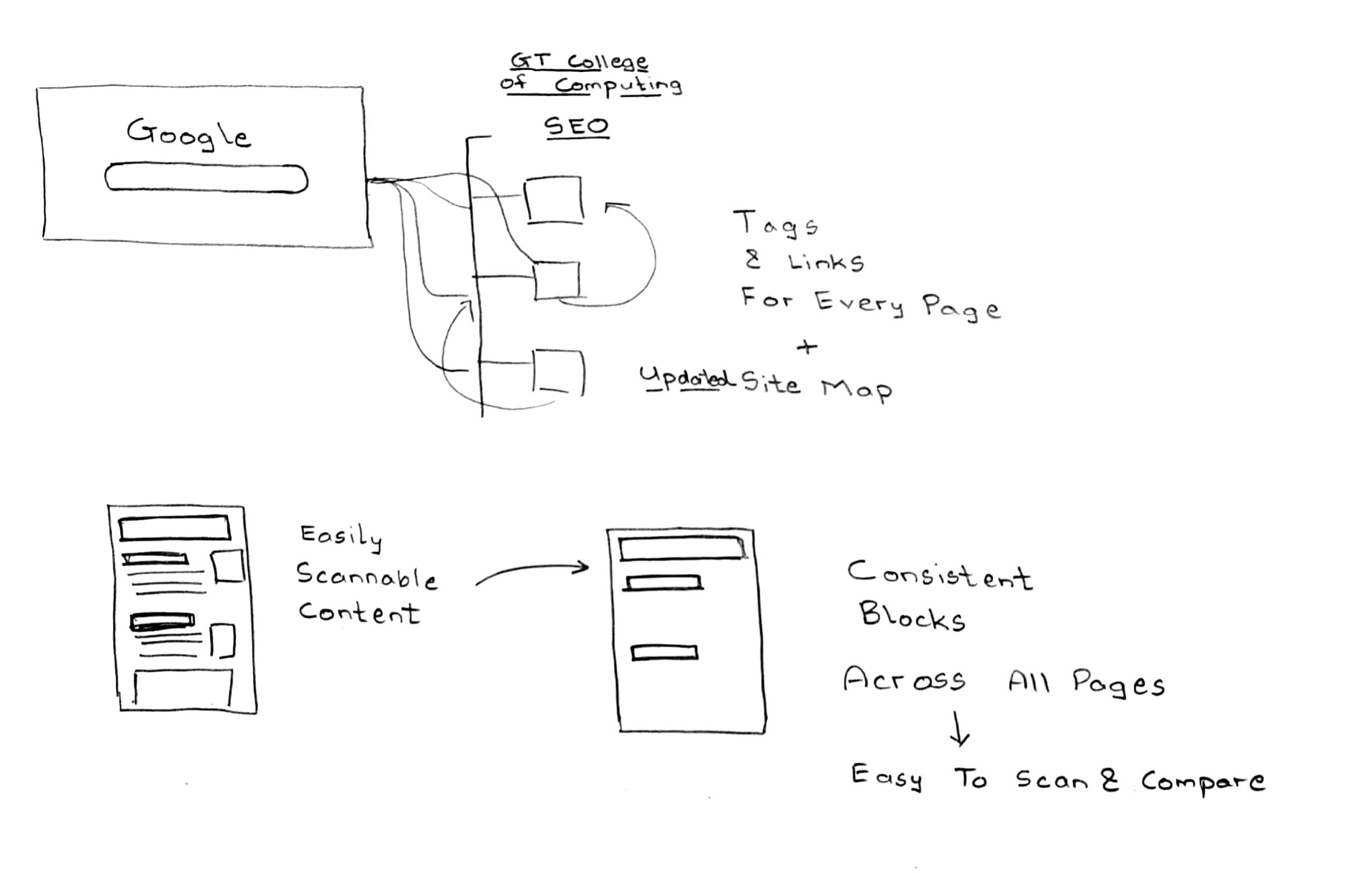
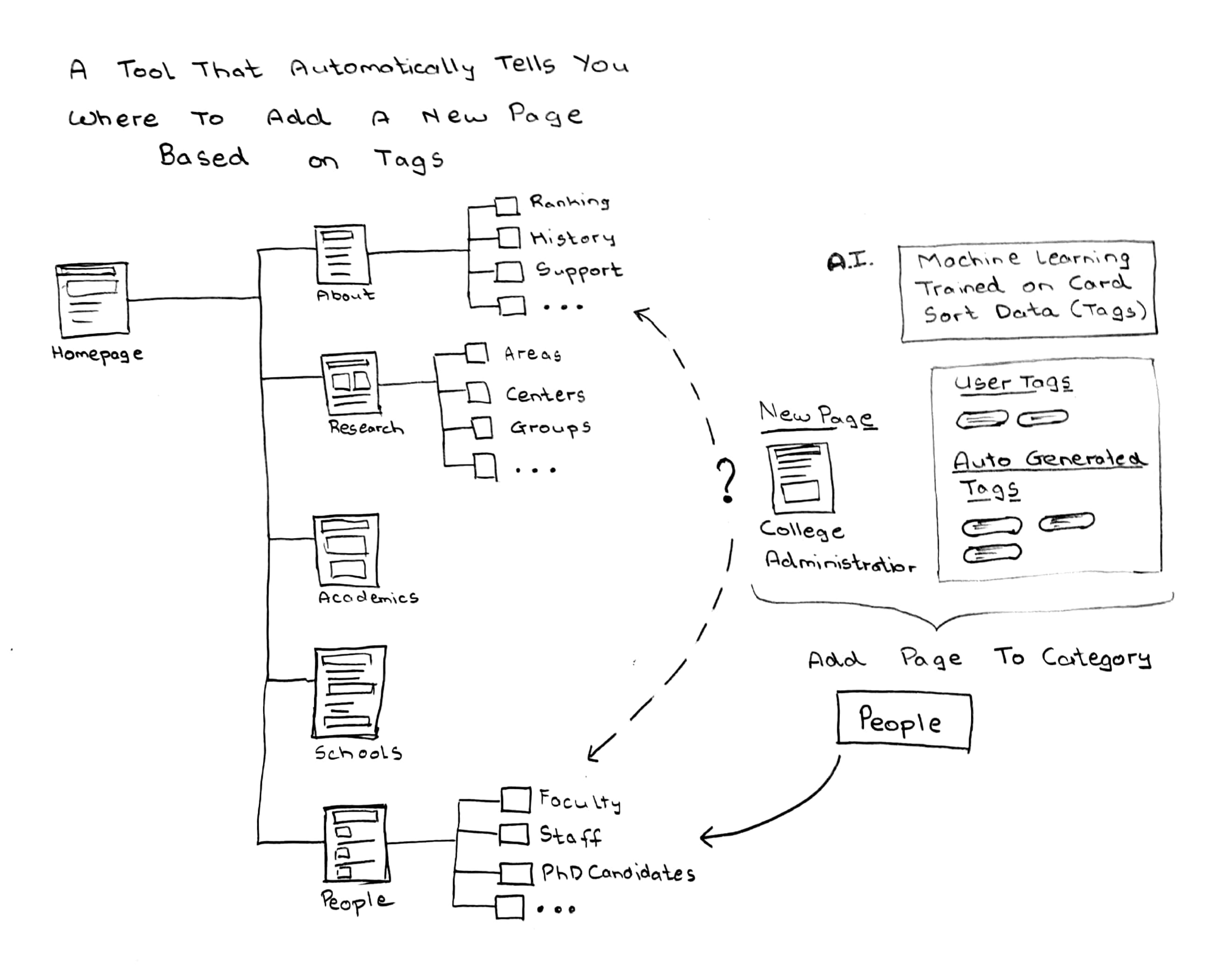
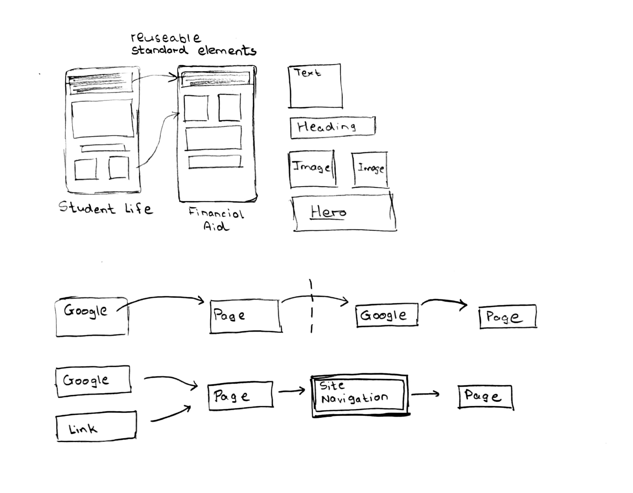
The user interface that we were designing was for the current content but was also to be adapted for any future content and changes that might have to be done. The optimum solution we found was to use a component based modular design approach. We derived our design system from Brad Frost’s Atomic Design.
This approach enabled us to devise a system of user interface groupings - or components - contextually linked to types of content that cater to our primary user groups: current and prospective students. In the design of these components, we started with smaller elements, like buttons, links, text, and headlines, and grouped them together according to the content.
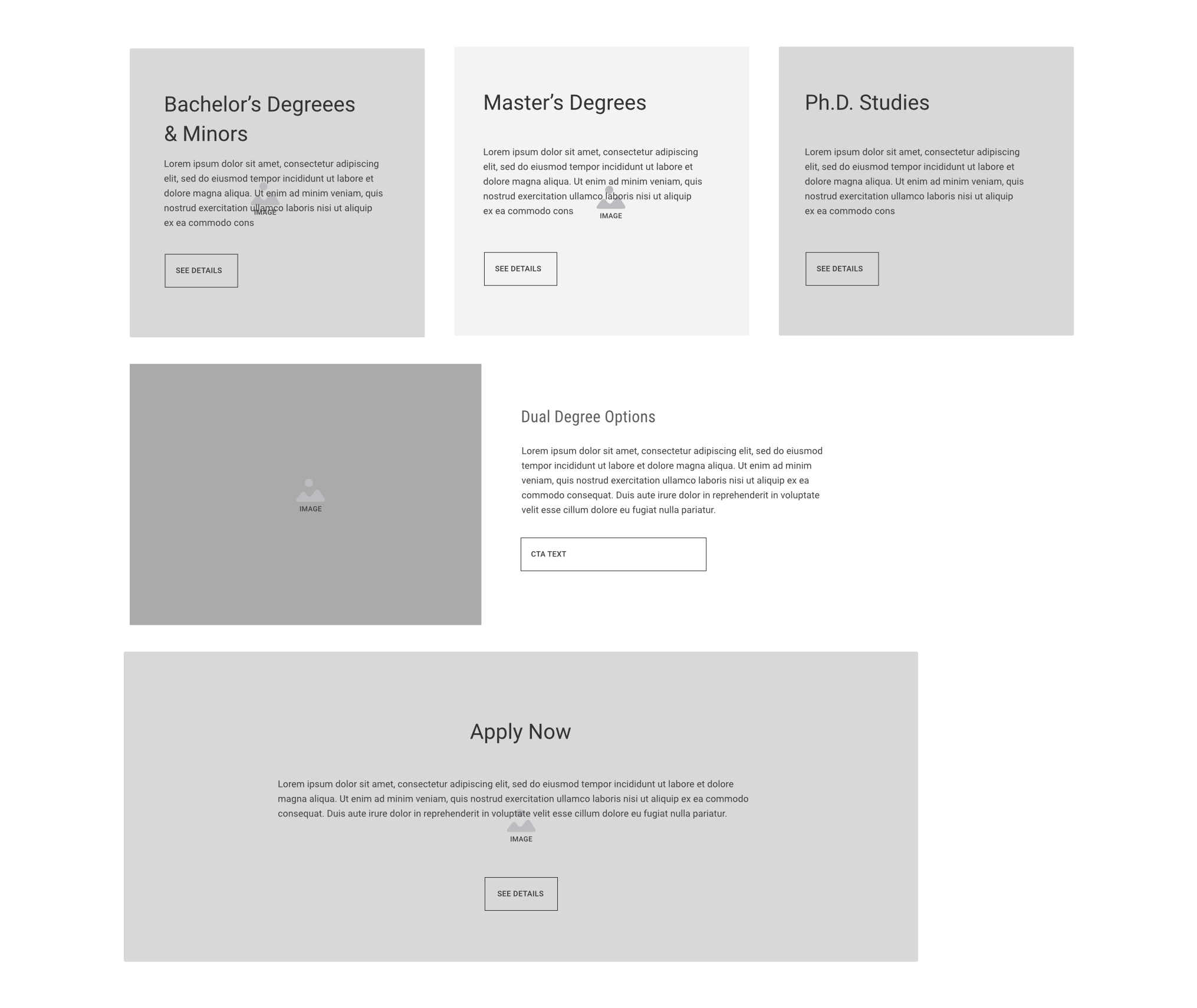
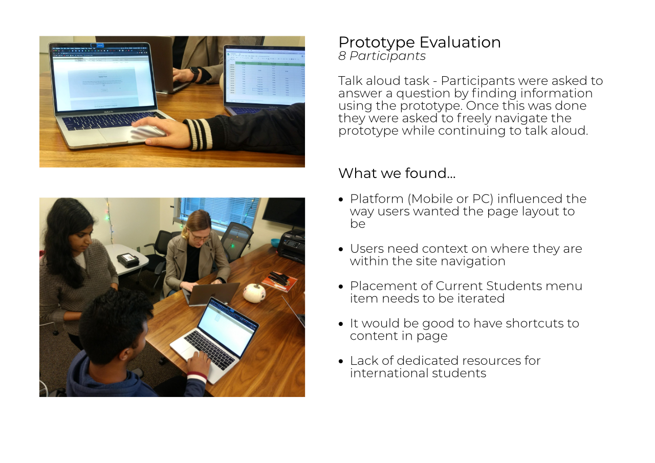
Because of how closely tied they are, we choose to design the content hierarchy and UI together, hand in hand. We started out with the content hierarchy. We designed a wireframe of the layout of elements and tested paper prototypes with users, to verify which designs were easily scannable for information. From the feedback, we finalized the content layout and converted the wireframes into UI elements.
To get user feedback on designing the page layout and content we conducted a hybrid task where participants arranged paper prototypes of UI Content cards on a blank page as they saw fit. We also used sticky notes to allow participants to come up with novel UI elements.
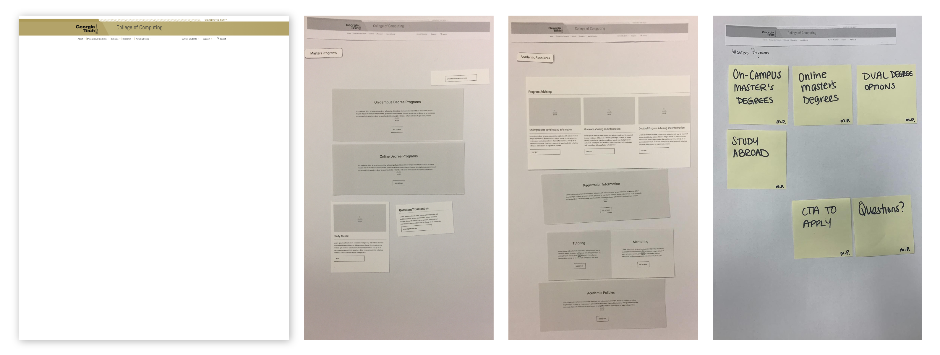
This feedback session helped us finalize our layout and proceed with designing mockups for the UI elements. The main feedback we got was:

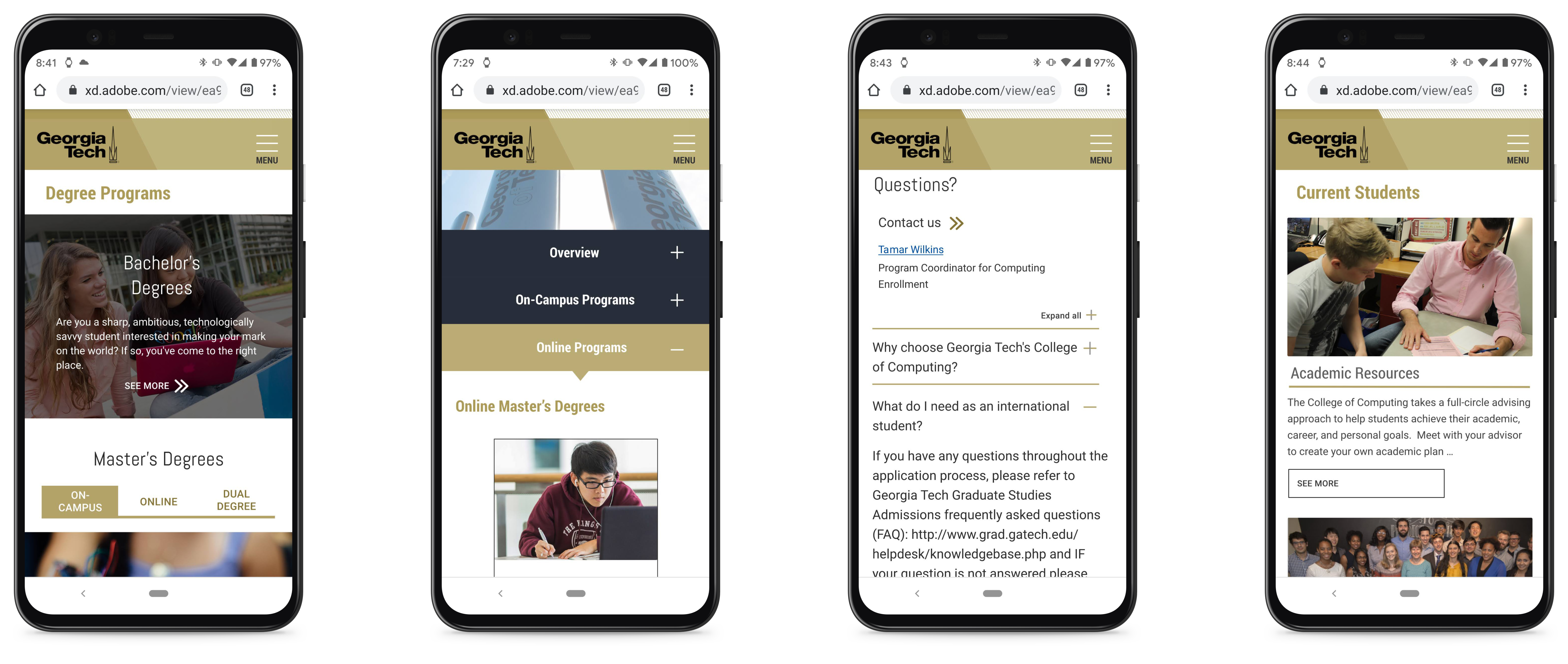
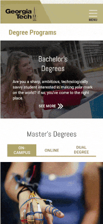
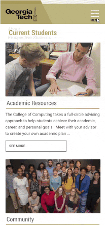
We designed an initial wireframe prototype with refined modular UI blocks which were designed and arranged based on user feedback. An interactive prototype was designed using Figma. We used the official Georgia Tech colors as per the University Brand guidelines.
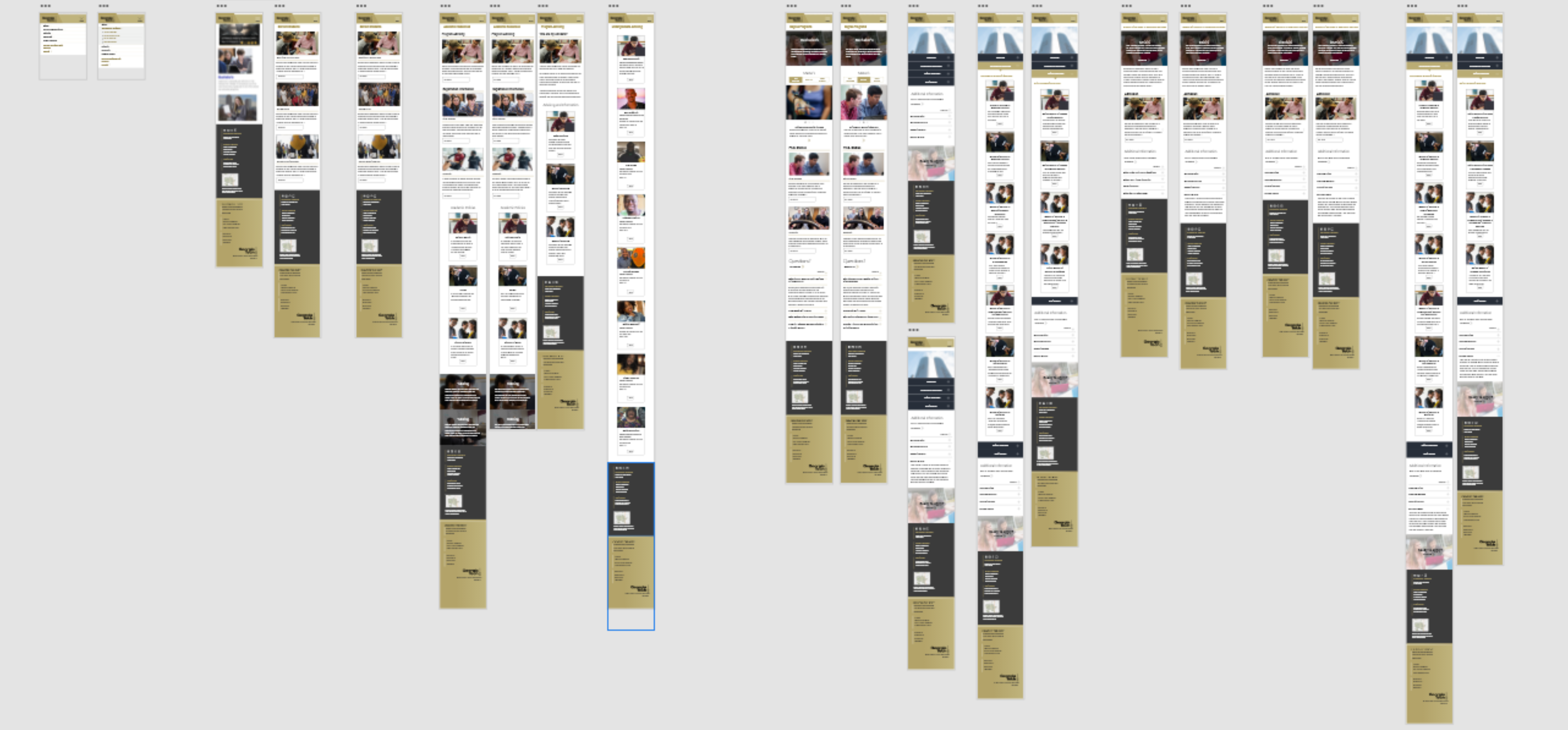
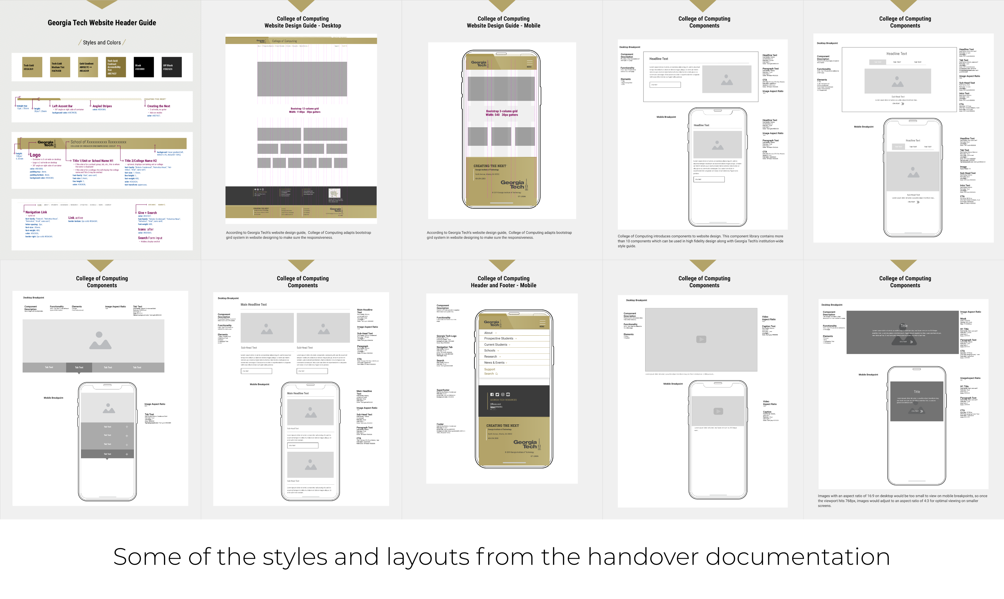
Towards the completion of this project, we gathered all the research, insights, designs and prototypes we had created and compiled them into a handover package. The handover package was made such that even someone unfamiliar with our work could easily understand it. It contained all the details required to develop the website from our prototype. We also included a style and color guide.
This project was an amazing learning experience. I had the opportunity to work with incredibly talented people and learn for their various domains of expertise. I was able to develop my skills through working on a project end to end towards solving a real problem. The final handover sections of this project were a great learning experience as I had not done something like that before. I'm grateful to have had a chance to work with such wonderful people, we are team Banana Mafia!